Graphic Design

Scion Magazine - Issue 5 (the Storytelling Issue) by Shingo Shimizu

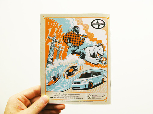
Scion Magazine Issue 5 (the Storytelling issue) continues in the same format as issue #4: 48 page magazine at 10.25" x 14.5", printed on the matte recycled stock.

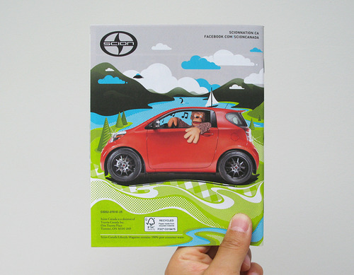
This is definitely my favourite of the covers for the magazine. Not only is it very different from what we've produced thus far, it's our first photographed cover (issue 3 only the cars were photographed, so that doesn't count). It also probably looks the simplest, but it wasn't! There was so much prep work beforehand in painstakingly designing and building the covers (which would not have been possible without our fab interns Olivia Truong and Ilona Fiddy), and then beautifully photographed by Andrew B. Myers. Also thanks to Lisa Marie Chen, my partner in crime on every issue, the Editor-in-Chief.

The textures and patterns are a combination of papers from 'the Paper Place' on Queen West in Toronto (I could totally just spend the day here...), as well as our own designs. The book spine designs reflect each of the stories in the magazine, as it works as a Table of Contents page as well. The challenge I face is always the bilingual factor, (as it is a Canadian magazine) with an English and French version. The type was added in post. To bring in 'car content' we put the 'Scion Book' on the front cover, reveals that it's Scion coffee table book on the back cover, with a Scion tC on its cover. 

CHECK IT OUT HERE!

Scion Magazine - Issue 4 (the Music Issue) by Shingo Shimizu

Apologies, for not posting for a while everyone! It's been quite busy since this project ended (which is SO great), but it means I have no time to write a proper post. 

Scion Magazine Issue 4 starts off a new format: 48 page magazine at 10.25" x 14.5" but still printed on the matte recycled stock. It's also the first of 'themed' issues, starting with 'the Music Issue'. Yes it was very exciting: bigger, more pages, and lots of music content! I thought I'd actually get quite tired of drawing speakers, records, or headphones...but surprisingly I didn't! It makes for great practice too~. 

Anyhow, more stuff being posted this week! Seriously. :)

CHECK IT OUT HERE!

Movember logos: Staachi & Staachi by Shingo Shimizu

Yes it's the time of the year when that ugly facial hair on men is allowed for one month we call Movember. I've donated in the past but this year I've decided I'm going to grow my mo. It's also the first time in my life, that I will be sporting it as well. I don't mind being laughed at, as it is for a great cause. I've joined my mates at Saatchi & Saatchi. Our team name, of course is 'Staachi & Staachi'! With a name like that the possibilities are endless, but it's best to keep it simple. 

So for the month of Movember, please help us raise a little money for raising awareness of men's health!

Make a donation today>


Logo and Poster for Red Bull District Rider: Brandon Semenuk by Shingo Shimizu

Just finished this last week. Logo and poster design for Red Bull District Rider: Brandon Semenuk. If you haven't heard of him yet, he's pretty much one of the top professional mountain bikers in the world.


Check out the teaser trailer for this amazing looking movie called, 'Life Cyles'. 

Life Cycles OFFICIAL Trailer from Life Cycles on Vimeo.


If you haven't seen Brandon Semenuk in action before, definitely check some more videos of him in action HERE and HERE! He really gets some serious air time. Insane!


Scion Canada Lifestyle Magazine Issue #2! by Shingo Shimizu

Another great experience, art directing on this sophomore issue of Scion magazine. Would like to send a big thank you to my chief editor (Lisa Marie Chen), and talented team of photographers, writers, and designers. Also a big shout out goes to Kimmy Yun for being a huge help with building the lovable Sasquatch costume, and Jack Ngan for advice on building it. (Will upload photos on building that soon.)

Yes we have a Sasquatch in this issue. Not only that, we feature: amazing Scion creations by Troy Sumitomo's Five Axis, an article on professional driver Kenshiro Gushi, some SEMA coverage, a Scion xB customizable paper car pull-out, and trying out some yummy poutine. Hungry?

Check out the cover and a few spreads from Issue #2 below of Scion Canada Lifestyle magazine. Scroll down for the download link from the Scion site, and a direct download link for the xB car template. Don't forget to have your go at customizing your very own Scion xB!


DOWNLOAD full version of Scion Issue #2 (PDF) here!

DOWNLOAD template for paper Scion xB here!

SEE how the Sasquatch was made!


Limited Edition Hot Sauce Posters & CD Giveaway! by Shingo Shimizu

So some of you may know, that I will be throwing a party with my Hot Sauce crew (We're not hardcore connoisseurs of the sauce). For about a year and a half or so, we've been running a music blog about our favourites in the electronic music scene. Obviously we all do it just out of the love for the music and want to share it with you.

We are finally set to launch a 'Hotsauce 2.0' version of the blog. It will feature much more content than before: artist interviews, reviews, videos, our DJ mixes, and exclusive guest DJ mixes. To commemorate this, please join us as we throw down HOT SAUCE 2.0 LAUNCH PARTY at Tequia Bookworm Friday November 12, 2010! Come early for free giveaways!


HOT SAUCE 2.0 LAUNCH PARTY!
FRIDAY NOVEMBER 12, 2010

Location:
Tequila Bookworm (upstairs!)
512 Queen St. West (map)

Djs:
DJ Shingo (listen)
MissRuckus (listen)
urbansteve (listen)

Free Giveaway!
First 27 people in will receive:
1. NEW HOTSAUCE MIX CD! (this was a lot of fun to record)
2. LIMITED EDITION PRINTS (11 x 17")! Only 9 copies of 3 different prints available. (see below) 

Drink Special!
If you were one of the lucky people who got one of the Hot Sauce buttons (see below) from Tequila, Slinky Music, or Magic Pony, then you'll get $4 shots all night!


Hope to see you all there!
:)


Graphics for Three Thirds Bags by Shingo Shimizu

Three Thirds Bags approached me to design a few graphics for their laptop sleeve cases for them a while ago. You may not have heard of them yet. They're a bit under the radar at the moment. But I'm sure they'll blow up soon, as their laptop bags are amazing. My Gravis bag is looking pretty lame...it's definitely time I get a new bag. Anyhow take a look at their products here!

The first design I did has a random font look, and the second one was inspired by pinball graphics. Both are featured in their promo video (below). Check it out!


'Pinball' Notebook sleeve.

Video directed by Daravong Thongsavath.


Scion Canada Lifestyle Magazine Issue #1! by Shingo Shimizu

It's been a very awesome experience with this project, as I was not only responsible for the front and back cover illustration, but the Art Direction and a lot of the design of the magazine as well. This 6 colour, 40 page, little magazine measures 5.5" x 7.125", and will be inserted into the back of Scion's car catalogue brochure. It is printed on a rather nice recycled stock as well. Look forward to pushing the design a lot further in Issue #2 which should be ready by early next year, 2011.

Check out the cover and a few spreads from Issue #1 below of Scion Canada Lifestyle magazine.


Feature on NXNE festival in Toronto. Awesome illustration by Ryan Lake.Feature on Troy Sumitomo of Five Axis.

One of my favourite spreads.

The original design featured a Mountie, instead of the lumber jack. It is actually quite difficult to get an image of the mountie approved, as it has to be approved. So always have a plan B. FSC logo to be inserted into the bottom right corner.

Download full version (PDF) of Issue #1 here!


Vintage graphics for Mini Mioche T-Shirts by Shingo Shimizu

Yes it's another collaboration with myself and designer studio mate, Matt Bilewicz. One of his clients, Mini Mioche, a local organic baby clothing company requested graphics with a vintage feel. MM provided us with the quotes, I did the illustrations and Matt was responsible for the typography. There was also an umbrella graphic done in the same style, but it didn't make the cut unfortunately. The quote for the boots graphic, was originally for the umbrella, but in the end the client felt the boots were more appropriate for the words. So that change was made in the end. I still do think the umbrella graphic is nice. So if anybody needs a vintage umbrella graphic, let me know or let them know that I want to know.


NEW! T-Shirt section is up! by Shingo Shimizu


Finally I've got around to compiling T-shirt designs I did over the last few years. It really takes a long time to compile, and it is adding a bit of weight to the site. Got to trim down the fat some time soon! Anyhow, please take a look, and let me know what you think! I will be posting some of my artwork onto T-shirts probably sometime in the near future, so check back soon. :)

Check it!


Hot Sauce! by Shingo Shimizu


SATURDAY FEBRUARY 20, 2010

Djs: MISSRUCKUS / URBANSTEVE / DJ SHINGO

UNIT BAR - 1198 QUEEN ST. W

spinning: Nu Disco / Deep House / Tech House / Techno / Dubstep / Broken Beat / Future Soul


Hello Hot Sauce fans. We're back! It's been a while since we played at our favourite local bar (Unit). We've been busy working on our new website, which will be up very soon. We have a few mixes up right now at our HOT SAUCE website, courtesy of MissRuckus and urbansteve. Finally you'll get a better sense of what we've been enjoying lately. We also have a new nifty logo (I had to change the cola one). 

Anyhow, take a listen, and hope to see you this Saturday night!


The Return of Hot Sauce: Tabasco Beats. by Shingo Shimizu


DECEMBER 12, 2009


HOTSAUCE: Tabasco Beats

DJs: SHINGO / MISSRUCKUS / URBANSTEVE


>>> UNIT BAR <<<
1198 Queen St. W, Toronto


It's been quite a long time since we last played out. There's been so much great music being released these days, that we can no longer ignore the temptation to DJ once again. (Not that we quit.) I usually keep music news and thoughts to my HOTSAUCE blog, but I'll still drop announcements here for events. As with 99% of my flyers and posters for my events it's my original work. This time around I've dropped the G.I. Joe motifs (totally random I know), and went for a more retro typographic approach (more fitting). Let me know what you think!